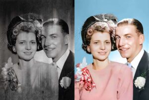
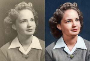
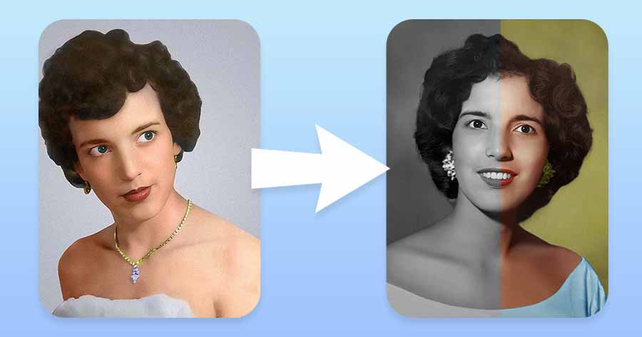
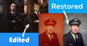
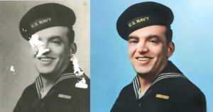
How to Colorize Old Images with Photoshop in 2026 with Video Tutorial
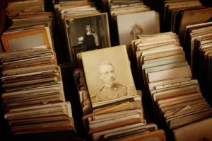
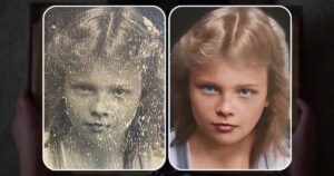
Have you ever discovered a box of old photographs capturing treasured moments from the past, only to discover that the vibrant colors have been lost or that they never captured a color in the first place?
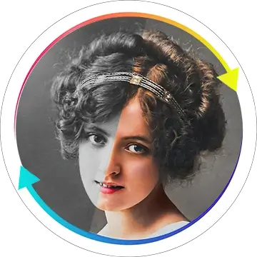
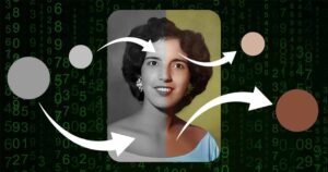
With this Photoshop tutorial on photo colorization, you will learn how to use modern technology and a little bit of effort to restore those monochrome photos to their original colors. We will discuss both manual and AI Photo Colorization in this article, but the emphasis will be on manual work and all of the important theory and thinking that goes into it.
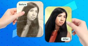
In this article, we will take you on an enchanting journey through the world of colorization, where you’ll discover how to transform your faded black and white photographs into stunning, color-rich masterpieces.
How To Colorize Old Photos Myself?
Have you ever asked yourself this question? We believe you did, and this article will provide you with all of the necessary information for colorizing your old photos on your own!
Here’s a taste of what you’ll discover:
- How to get your image ready for colorization
- How to choose “Right” colors
- How to Incorporate Depth and Realism
- How to preserve uniqueness
- How to colorize photos both fully manually and assisted by AI
Amazing! Before we continue, we wanted to address a few frequently asked questions:
- If your photo is not only black and white, but also damaged? If you want to restore your old and damaged photos at home, read this article instead.
- Don’t want to learn any theory or perform manual restoration? In this tutorial, we will show you how to implement AI naturally. You will still get natural-looking results, but they will be mostly done by AI!
- If you are looking for a 100% automatic AI colorization, check this article AI Photo Colorization!
- Do you want to learn how to colorize old photos by hand? Read the entire article; the knowledge shared here will provide you with years of photo colorization knowledge in just one article!
By the end of this guide, you’ll possess the knowledge and skills to embark on your own colorization journey, revealing hidden worlds of forgotten colors and breathing life into moments frozen in time.
So, let’s dive in and unlock the boundless possibilities of colorizing your old black and white images with the magic of Photoshop.
How to Colorize Old B&W Photos in Photoshop – Easy Video Tutorial 2026
If you prefer to lean things in video form, please see the tutorial above. Please keep in mind that the video is primarily intended to demonstrate how photo colorization works. We still recommend reading the article if you want to understand the theory and mechanics behind this process!
Photo Colorization Theory
Before we get started with photo colorization, let’s go a little deeper to learn about what photo colorization is and how it works to ensure your photos look natural and beautiful.
How Do Artists Choose The Right Colors?
Learning how artists choose colors for photo colorization is a time-consuming task that cannot be explained in a short section like this. The important thing you need to know is that there is few styles of photo colorization that differ from each other depending on how much they are striving to achieve accuracy neglecting beauty of the final, or achieving the beauty neglecting the accuracy.
Styles of photo colorization:
- Artistic colorization: a strong emphasis on the visual appearance of the final image, with no need for accuracy. Often, artists who work in this manner do not conduct any research before beginning to work, instead working solely from their imagination and according to their preferences in order to achieve the most beautiful and often painting-like colorization.
- Accurate Colorization: a strong emphasis is placed on the accuracy of the colors on the photo, even if the results are not particularly pleasing. Frequently supported by a large body of theory, extensive research, and references.
- Mixed colorization: something in the middle, aiming to make an image look beautiful while keeping some colors true to their original state.
The last one is the one we frequently use to work and will teach you in the following chapters. To make things easier for you, we’ll concentrate on the beauty aspect rather than the tedious and difficult-to-achieve accuracy aspect.
Use reference photos
As was said before, this tutorial is not focused in 100% accuracy of the final result, especially because you can’t colorize photo back with such accuracy, because inevitably there will be some color details loss and altering.
Nonetheless, reference photos is what helps us, and will definitely help you to go as close to original colors as possible, without actually altering it
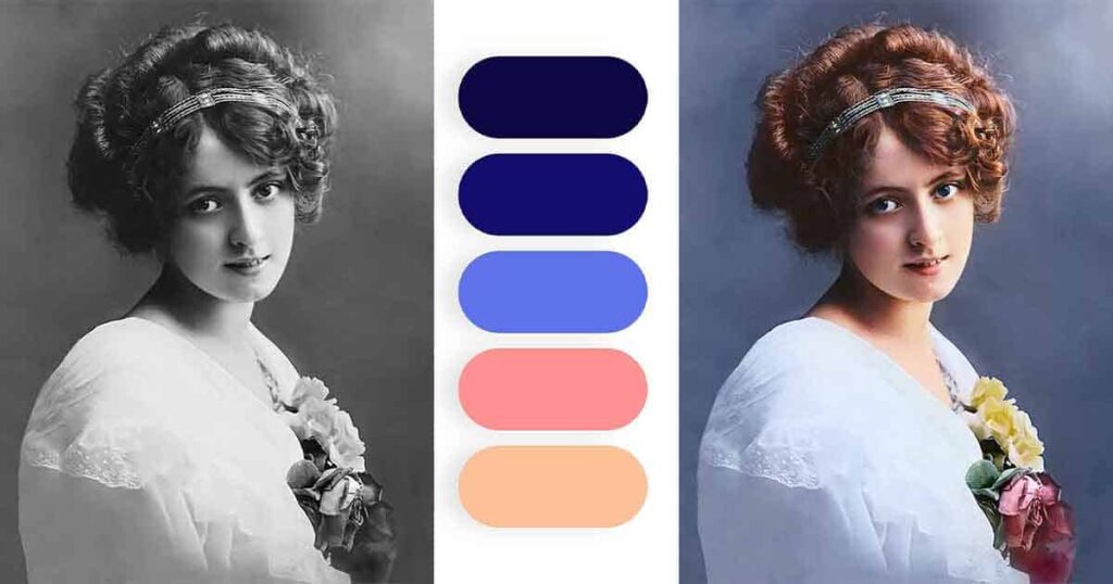
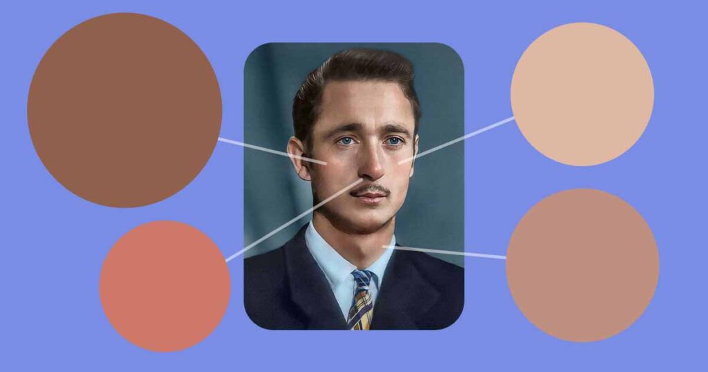
Skin Colorization
People are probably the most popular and interesting subject in photo colorization. At the same time, it is one of the most difficult topics in photo colorization because of how complex humans are and how well people can see that something is off in other people’s appearance, even if they can’t describe it.
But don’t worry, we have a few pointers on how to choose skin, eye, and other feature colors in this manner so that your colorization always looks natural!
Use unsaturated colors
When it comes to coloring old photos, the most common and thus most off-putting mistake that many beginners make is using very saturated colors for the skin, essentially turning the skin of the person they are trying to colorize into a cartoon character like Homer Simpson.
Naturally, people gravitate toward more saturated colors, believing that more is better, but this is not the case here because it makes skin look more like a plastic material, fabric, or anything other than skin.
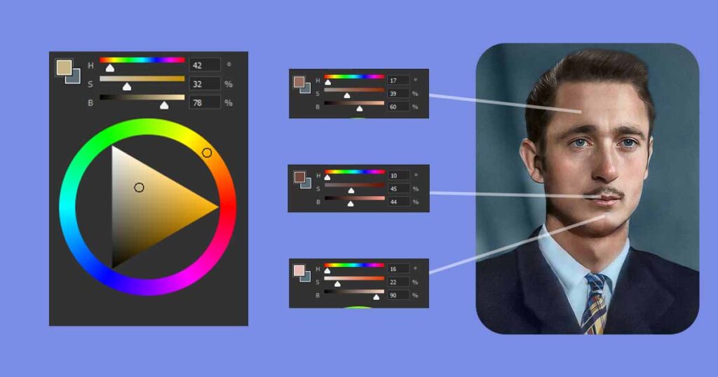
To control how your color appears, use any tool that constantly displays details of the colors you select, so you are always aware of what you are doing. We recommend that you use the Color Wheel.
Color Wheel
Color Wheel is an awesome Photoshop tool that allows you to pick, control, and use any color with high precision, as well as get all the information you need about any color in real time!
To enable and use this tool, go to the Window tab and select Color. To ensure proper use, click the menu on the right top side of the Color panel and select the Color Wheel option.
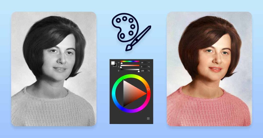
After you enable it, you’ll see a tool with three sliders: H, S, and B (HSB color mode). These letters have the following meanings:
- Hue: it is a color, tone, or tint.
- Saturation: determines how saturated a color is. Whereas 100 represents pure color, 0 represents no color at all.
- Brightness: refers to how dark or light a color is. Where 100 is the brightest color possible (pure white, no other color can be brighter than 100) and 0 is the darkest color possible (pure black, no other color can be brighter than 0).
The triangle in the Color Wheel can be used to control all free aspects of the HSB slider.
- Vertical axis: moving it up or down changes the brightness or darkness of the color.
- Horizontal axis: left or right changes the saturation of the color.
Here are some guidelines for how saturated your colors should be:
- Mid Tones: between 20 and 40
- Shadows: between 50 and 60.
- Highlights: between 15 and 30
To understand it better, remember that black, white, and grey are tones, not colors! They can be mixed with color to make them darker or brighter, but they are not colors in and of themselves.
Understanding Black, White and Gray values
Consider a situation in which someone used a powerful flashlight to blind you. This is unpleasant to imagine, but everything you will be able to “see” in this situation is pure white, regardless of what else is around you or what color it has; you were simply blinded, and white light removed all other colors for you, not matter how colorful is the world around you.
Consider the following example: You are staying in a colorful home with many vibrant colors such as blue, red, yellow, and green on the walls, furniture, and everyday items, but your entire city is without power, and the skies are cloudy, so it is as dark as it can be. What will you see? Will you be able to see your bright, saturated clothes or anything else? All you’ll “see” is pure black.
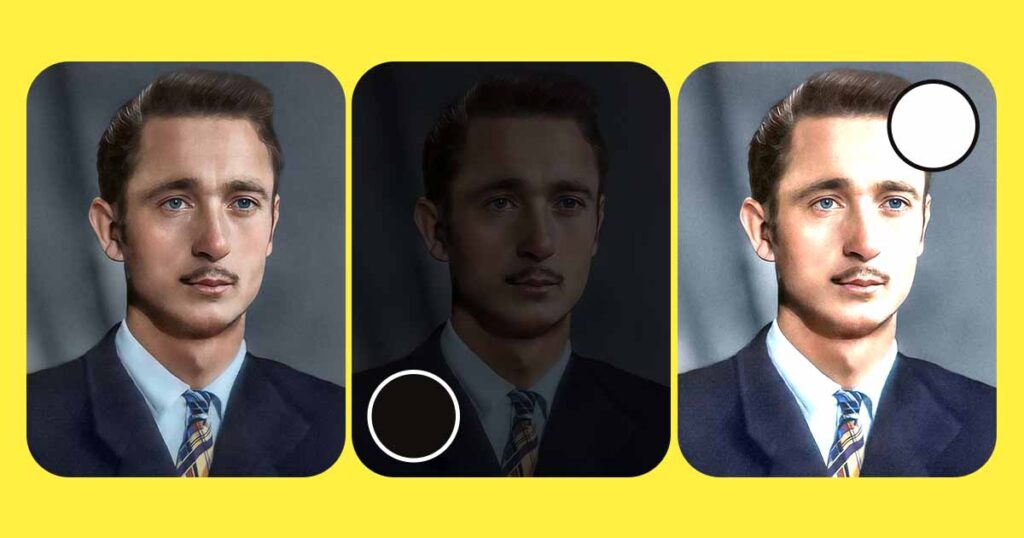
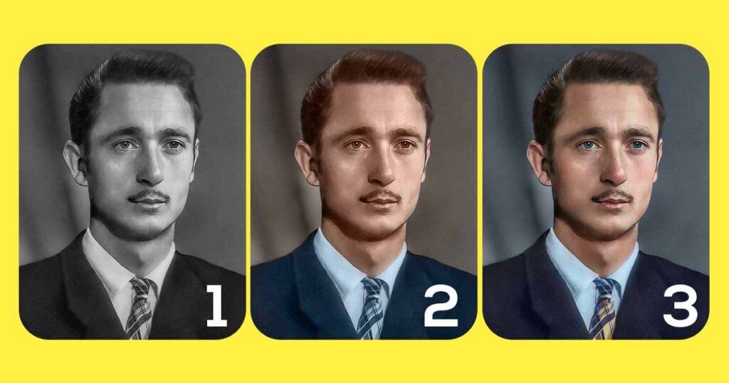
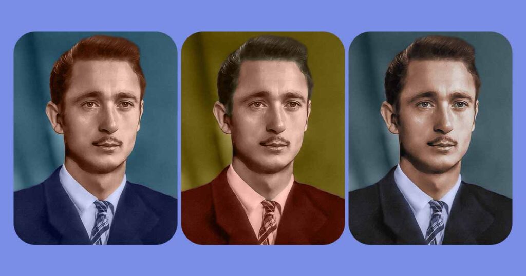
Three examples are shown in the example image above:
- Regular colorized photograph
- The photo is overly dark
- The photo is overly bright
Both the second and third examples, as you can see, are not particularly visually appealing, but we wanted to show you something else. If you pick any area that previously had color, it will no longer have it, so saturation will be 0 or very close to it in areas that are 100% black or 100% white, or very close to it.
In the digital world, this is exactly what white, black, and thus greys do with colors. The higher the Brightness value, the less saturated the color becomes until it is completely washed out by pure white or pure black.
Color can reach the highest saturation value with a Brightness of 50 (Gray), pure white with a Brightness of 100, and pure black with a Brightness of 0
Small details can make a big difference
Before we begin, there is one more thing you should be aware of. One small detail makes no discernible difference; ten small details drastically alter the image; while you may not be able to see all of the changes, you will feel them.
It all boils down to how complex our brain is. We have a lot more going on in our brains subconsciously and automatically than we realize. That is why, even if they have never drawn before, most people can tell whether a painting is realistic and beautiful or ugly and distorted.
If you ask them why they think the painting is ugly, they will say something like “I don’t know, something just looks off,” which is the effect we are referring to. If you fix any minor issues you find, the image will look much better; if you leave them alone, they will ruin the look of your colorization.
Of course, these are not “small mistakes,” but they were purposefully exaggerated so that you could see how a series of minor changes can drastically alter the appearance of an image. We’ll learn more about it in the tutorial’s practical section.
Examples of minor details that make a significant difference:
- Some details are missing: such as coloring the face and not coloring one finger on the person’s hand in the portrait photo.
- Coloring objects nearby: you colored the person’s hair brown, but you also colored the background behind it and didn’t fix it.
- Coloring a face with one flat color: flat color is a good starting point, but don’t forget to color pupils, add red to the lips, blush to the cheeks, and white to the eye white.
You will learn more what Flat Color Layer is and how to use in in this tutorial, so don’t worry.
Work from big to small
The final piece of advice is to work from large to small. That is, you should color the largest objects or parts of the image first, without paying too much attention to the inner details. You should still make sure the outline is as good as it can be, because it will be more difficult to fix later.
In a portrait example, this is explained:
- Select and colorize the person’s entire face. Check that the outline that separates it from the background is clean and well-done.
- Create smaller separate selections within the main selection and use them to colorize lips, eyes, teeth, and so on.
- Using the first, entire face selection, make a smaller selection to colorize the person’s hair.
Rep for each section of the image, starting with a large selection with accurate outer borders and then using it to create and colorize smaller details within.
This should give you enough theoretical knowledge to continue with the process!
Manual Photo Colorization in Photoshop
Let’s put our newly acquired skills to the test now that we know some basic theory about photo colorization and important tips on how to apply this knowledge!
This section is for people who want to manually colorize their photos. It will be more difficult and time-consuming than AI-assisted colorization. If you don’t want to do it manually or if you’ll get confused later, just skip it and go to the Mixed Photo Colorization section!
1. Open the Photoshop File
If you previously followed our tutorial on how to restore the photo and saved it as a PSD file, open it from the recent files dashboard in Photoshop. If not, simply go to File and click Open, find the photo you want to colorize, and open it!
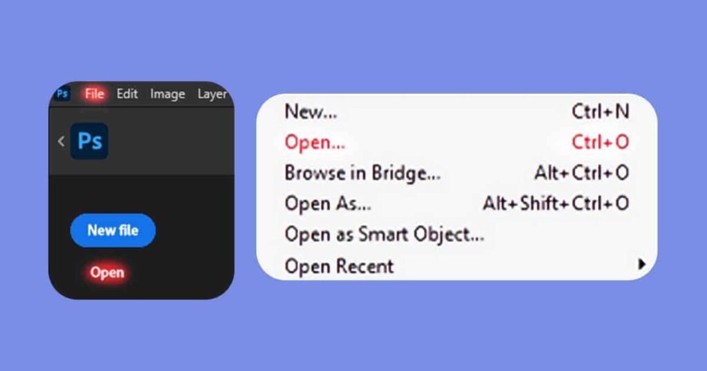
If you have a photo that was not damaged but was simply black and white, open it by going to File – Open or simply dragging and dropping it inside Photoshop.
Make the Photo Truly Black and White
The problem is that some old photos that appear to be completely black and white still have a light orange (sepia), blue, or green tint. This could be a problem in the future because it will affect how our colors appear.
It is simple to correct; simply create a Black & White adjustment layer. Done! Your photo is now 100% monochromatic!
Check the Color Mode
This is a quick and simple step, but take it now to avoid frustration and confusion later.
- Navigate to Image – Mode.
- Examine the file’s color mode.
- If it’s RGB, that’s fantastic; just leave it as it is.
- If it is anything other than RGB (such as Greyscale or CMYK), change it to RGB, click convert, and confirm all the windows that may appear.
You should have no trouble later colorizing your old photos!
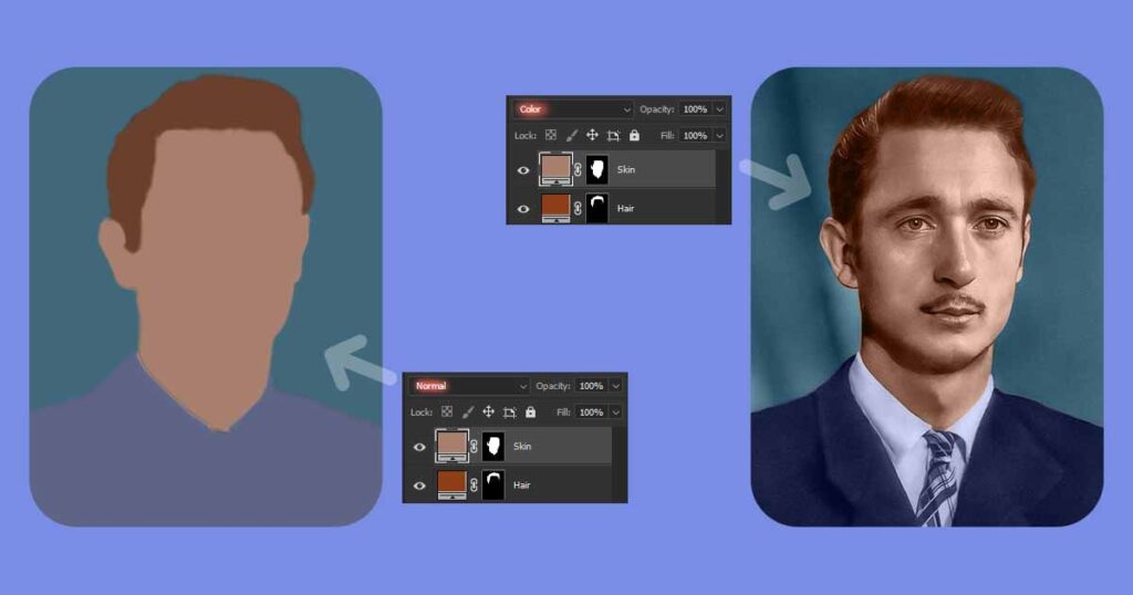
2. Create a Flat Color Layers
Flat Color Layers are layers that are entirely made up of one color. Depending on the layer bending mode, it can either cover the entire image or a portion of it with a flat, completely even color (Normal blending mode) or affect all layers beneath it (Color blending mode).
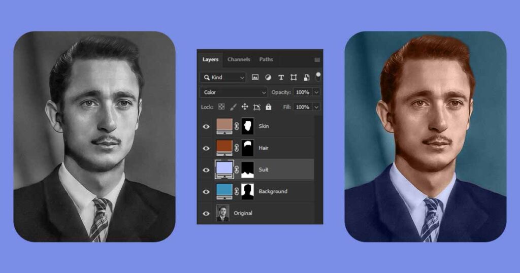
Here are some examples of what we mean by “Flat Color Layers,” how they look, and how they work with various blending modes.
Why use flat color layers?
Using flat color layers in Photoshop for colorizing black and white images offers a range of benefits. First, it simplifies the organization of your project, as each element or area can have its own dedicated layer, making it easy to work on them individually without affecting the rest of the image.
Moreover, flat color layers allow for flexible and non-destructive editing. You can tweak and adjust the colors at any point without permanently altering the original image. This gives you the freedom to experiment and make changes until you’re satisfied with the result.
Color blending and changing made simple
Blending modes in Photoshop further enhance the colorization process. These modes interact with the layers below, creating realistic effects such as highlights, shadows, and color blending. By trying out different blending modes, you can achieve more nuanced and captivating colors in your images.
With flat color layers, fine-tuning your color choices becomes a breeze. You can easily adjust:
- Hue, Saturation, Brightness of the color
- Opacity of specific colors without affecting the rest of the image
This level of control allows for precise adjustments and a more tailored colorization outcome.
Additionally, flat color layers can be seamlessly blended using layer masks and blending brushes. Layer masks enable selective reveal or hide specific areas of the color layer, ensuring smooth transitions and precise application. Blending brushes aid in creating natural gradients and seamless color blending for a polished final result.
Use Selection Tools
Selection tools, such as the Quick Selection Tool, Lasso Tool, Marquee Tool and Select Subject Tool, enable you to isolate specific areas or elements within your image. This targeted approach allows for focused color changes, ensuring that your edits only affect the desired regions.
Select any area of the image that will have similar color after colorization using any selection tool you prefer, for example:
- Skin on the face or elsewhere on the body
- Shirt or any other piece of clothing
- Greenery such as grass and tree leaves
- Sky and clouds
After you’ve finished with the selection, create the flat color layer.
Flat Color With Adjustment Layers
Adjustment layers are invaluable tools for precise and localized color modifications. By utilizing adjustment layers, such as Curves, Levels, and Color Balance, you can fine-tune the colors in specific areas of your image, achieving a harmonious and balanced result.
In this case, we’ll be using the Solid Color adjustment layer. Now that you’ve completed the previous step’s selection, simply click the Adjustment Layers icon, navigate to the Solid Color layer (the top one in the list), and click it.
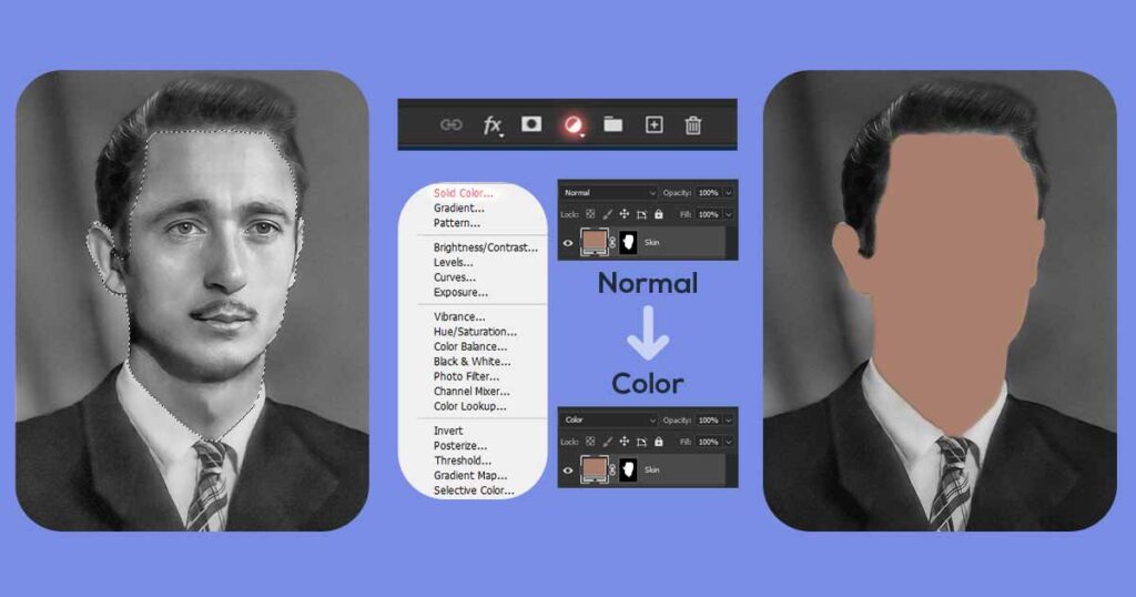
If done correctly. The layer will be automatically created with the mask of the shape of the selection you created, so it will only color the are you selected, and not anything else.
Repeat it to create Flat Color Layers
You can now use any selection tool to select other parts of the image that have similar colors. Repeat this process until you have flat color layers for all of your image’s objects and areas.
It may take some time first, but it will allow to save a lot of time later on!
Create Flat Colors Layers only for big areas
One important note about using Flat Color Layers and adjustments layers like Solid Color is that they give you flexibility in terms of changing the color and how it blends at any time later, but they are ineffective for working with small details because creating such layers is a slow process, and using it for small details would be very painful.
Small details in the photo should be manually colorized using New Layer in Color blending mode. In the following chapters, we will go over it in greater detail. For the time being, let us just show you where you should use flat colors and where you should work with regular layers.
Color large details with Flat Color Layers, such as:
- The individual’s entire skin
- The hair on the head, beard, mustache, brows, and so on
- In the background, there may be grass or leaves
- The sky and clouds
- Anything made of the same material, such as ground, concrete, wood, and so on
FC layers should only be used for coloring fine details! Color any other smaller details on the image with a new layer in Color blending mode!
Make Flat Color Layers look more natural
Now that we’ve created flat colors for all of the image’s components, it’s time to make them look natural. When you’re finished with Flat Color Layers, change the blending mode to Color.
Isn’t this much better now? Sure, but does it appear natural? No, not yet. A few more changes are required to make it more natural.
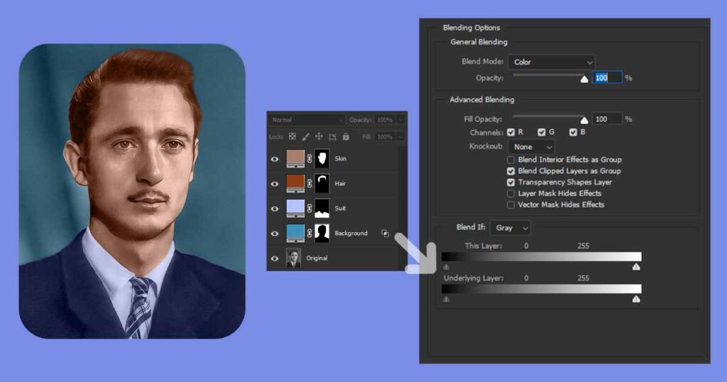
Blending Options
You’ll need to use the Blending Options menu to make it look more natural.
- Although the names are similar, do not confuse them with the layer blending mode that you have already changed from Normal to Color.
The Blending Options menu can be accessed by either right-clicking the layer name and selecting Blending Options from the dropdown menu, or by double-clicking the layer name.
You will see something like this. Now let’s learn how and why to use it.
Theory behind the use of Blending Options
Without delving too deeply into theory, let us quickly review what we learned in the Colorization Theory section:
- The most color is found in midtones (the most common).
- There is no color in areas that are extremely bright.
- There is no color in extremely dark areas.
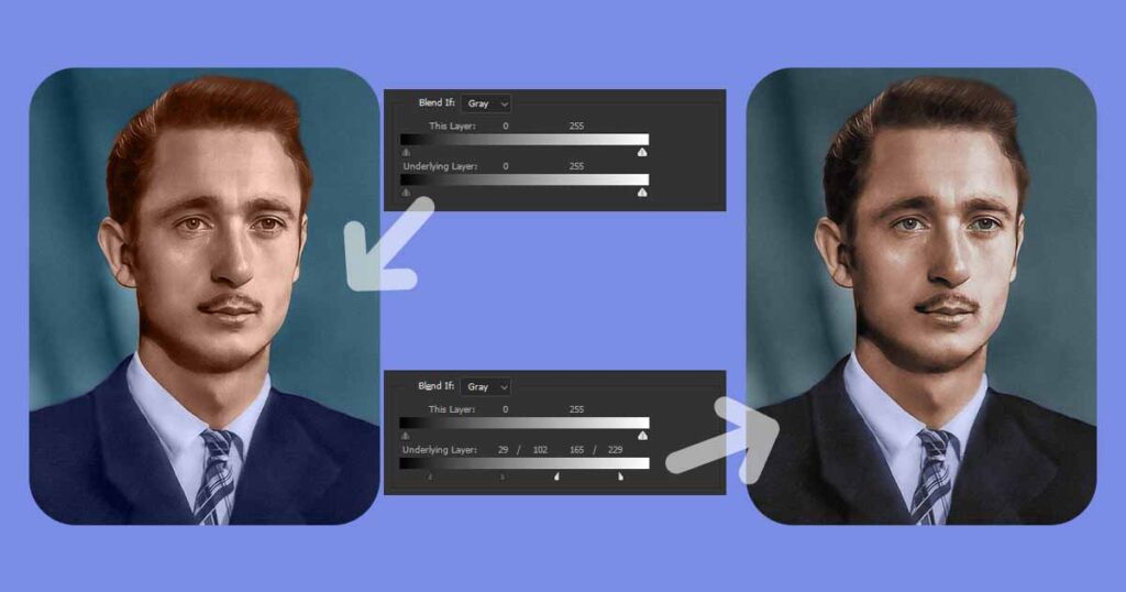
Awesome, so, now how to make this in Photoshop without manually masking it? Here is when Blending Options comes handy!
There are two sliders in the Blend If section of the window: This Layer and Underlying Layer. We will not use This Layer with flat colors in this case because it will not work.
Instead, we’ll use the Underlying Layer slider because it’s exactly what we’re looking for!
Underlying layer
The Underlying Layer slider removes pixels from any layers beneath the current (Flat Color Adjustment) layer (original black and white photo):
- Moving the slider’s dark pin to the right will remove dark pixels from this layer. The further to the right you move it, the more dark pixels become visible.
- Moving the slider’s bright pin to the left will remove bright pixels from this layer. The further to the left you move it, the more bright pixels become invisible.
You now understand what they do. Now, before you start dragging them, do the following:
- Hold the Alt key
- Click on both Darker and Brighter pins of the slider
This will split both pins into two pieces, giving you a “smooth range” instead of a “point” of exclusion. So, instead of the rough transition you would have gotten without the splitting pins, you will now have a smooth and natural transition!
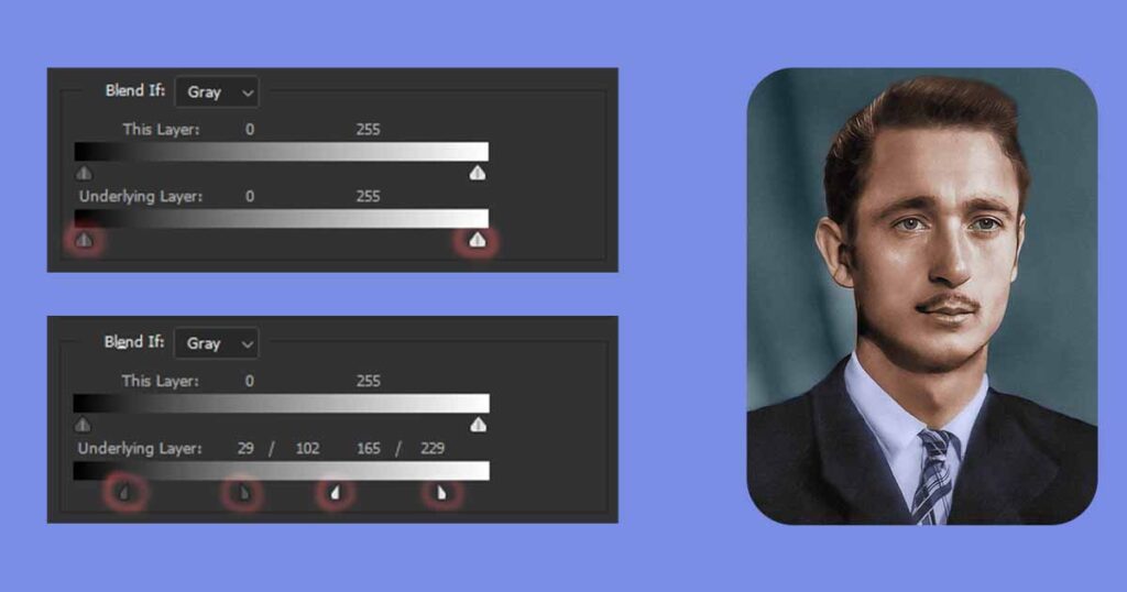
So, by slightly dragging the Brighter pin of the slider to the left and the Darker pin to the right, we carefully excluded colors from both the darkest and brightest areas, without affecting the midtones.
Do it for all layers
Different layers require varying degrees of exclusion from both the dark and bright sides of the slider; don’t use the same values for all the images in the set; instead, make personalized changes for each layer.
The changes to the image will be visible in a read time! Play around with it until it feels and looks good. There are no exact numbers, so simply look at your image and make changes until you like how it looks.
Repeat this process for all of your Flat Color Layers!
3. Create New Color Layer to Add Details
Excellent work; now that you have Flat Color Layers that are properly blended, it is time to work on details. Because our main color blocks are already in place, we can now focus on smaller, more precise details.
Working with Solid Color layers, or any other adjustment layers, would be a great idea in this case because these types of layers are very limiting in the case of creating details.
Use regular layers with the blending mode set to Color
Flat Color layers would be completely ineffective in this situation. This is why. For example, if you want to colorize the details of the face further, you’ll need separate layers for:
- Pupils
- Eye white
- Blush
- Lip
- Teeth
And so forth. To colorize the face more or less believable with flat colored layers, you will need at least 7 layers (given that we already have two, one for hair and one for skin). It will be slow and inefficient in every way.
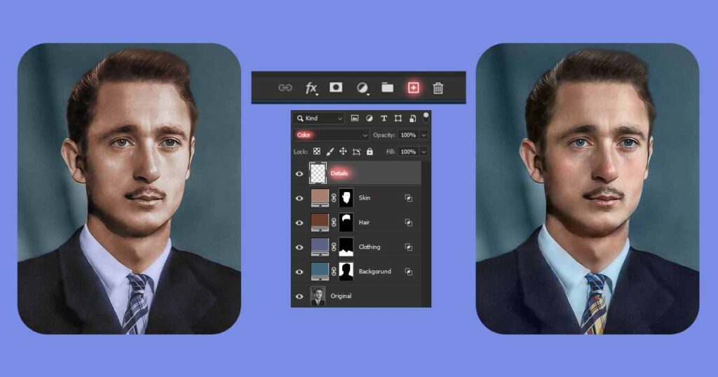
So instead of working with dozens of separate adjustment layers, that will get tiring really fast, you will have around 10 layers with flat colors, and 1-2 layers with details!
How to colorize details regular Color layer
Okay, now that you’ve created Flat Color layers for all of the big and important things like skin, clothes, hair, sky, and so on, and naturally blended them together with Blending Options, it’s time to colorize details more precisely.
It’s obvious that these flat colors don’t look right, because instead of the billions of colors our eyes are used to seeing, we only see 10-20 at most. We will get it fixed in a minute. But first, let’s set up our tools properly.
How to set up your brush for colorization?
Setting up brush for photo colorization it is actually easy task.
- If you have a graphic tablet; It will work perfectly. You don’t need to change anything if it uses brush pressure information even with the default settings.
- If you use a mouse: We will make a few minor changes that will allow you to work very similarly to those who use a graphic tablet.
There are few changes you need to make:
- Flow: When the Brush tool is active, you can see this value in the top panel. Set the flow rate to 2-5%. Flow assists in simulating the pen pressure of a graphic tablet.
- Opacity: Never change it while colorizing photos; it will ruin the look of the photo and cause it to appear blotchy. Keep your brush opacity at 100% at all times and never change it.
What is the difference between Brush Flow and Opacity?
Opacity affects the overall transparency of each stroke, while flow determines the rate at which paint is applied, enabling gradual buildup and nuanced blending.
- Opacity: Affects the visibility of the underlying image by determining the overall transparency of each brush stroke after each mouse click. Set the opacity to 50%, for example, and each stroke will be semi-transparent, allowing some of the original image to show through.
- Flow: Regulates the rate at which paint is applied to each brush stroke, even with a single click, allowing for a more gradual build-up. Set the flow to 50% and make multiple passes over the same area, for example, and the paint will accumulate over time, resulting in a smoother and more controlled blending effect.
In both examples, the use of Opacity and Flow allows for control over the transparency and gradual buildup of the applied paint, enabling you to achieve the desired effects in your photo restoration tasks, but Flow is much more fitting option here.
How to get right colors?
As previously discussed, there are three types of photo colorization: realistic, artistic, and mixed. We will skip realistic colorization because it will take you years to learn and apply it. Instead, we will focus on the other two styles that you can learn and apply much faster.
Artistic Style
Artistic colorization is all about how good the final image looks, with little regard for preserving its originality.
- Emphasize mood and expression: Focus on creating an emotional impact by using colors that enhance the mood of the photo. Experiment with bold and vibrant colors or muted and desaturated tones to convey a specific atmosphere, and just have fun!
- Add deliberate color choices: Make intentional color choices that deviate from reality to express your artistic vision. Use contrasting or complementary colors to create visual interest and convey a particular artistic interpretation.
Mixed Style
The mixed colorization technique combines the best of both worlds, combining originality and authenticity with artistic beauty. The good news is that you can choose the ratio of artistic look to original colors.
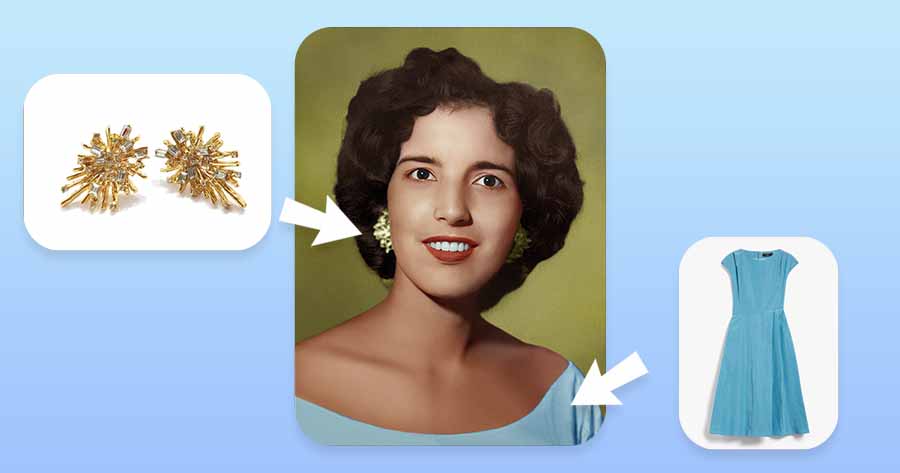
- Use references: Use photos for color references whenever possible. If we’re talking about a person, we can use another color photo of that person, or if you don’t have one, use one of his close relatives with similar skin color.
- Do research: Don’t have any photos to use as color references? You can still find information on your own. Inquire about your relatives’ skin tone, eye color, and hair color. You can even inquire as to what color of clothing the person in this photograph was wearing.
- Add artistry: Whether you discovered some information about the colors of the main details on the photo or not, you can now simply show your artistry and choose colors that you find appealing, and everything will look great!
- Use AI: Although this section of the tutorial is not about AI, if you are feeling lost and stuck and don’t know what to do with colors next, simply use AI to pick colors for you and refine them yourself!
Remember, the choice of style is subjective, and it depends on your artistic vision and the desired outcome for each photo colorization project. Experimentation and practice will help you refine your skills and develop your unique approach in achieving the right colors for each style.
What details to colorize to make huge difference?
When it comes to photo colorization, there are several key details that you will need to colorize with special attention. If you will do it, it will help you to drastically improve the beauty and accuracy of your colorized photo, especially, if you were colorizing a person!
But, if you will miss or neglect colorizing these small details you will get noticeably lower quality result, and while most people would not be able to tell what is wrong, photo will feel off.
In the following chapters, we will discuss some of the most important details to colorize and considerations to make while doing so!
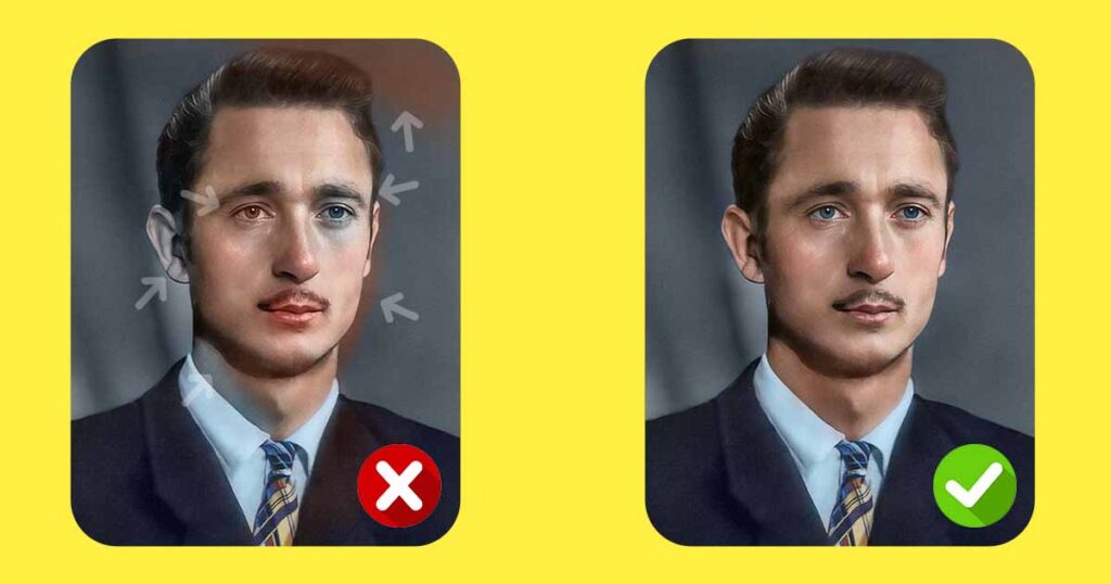
Fix any careless borders
It is not technically a details itself, but it is very important concept that will make huge difference of how your final result photo looks.
Examples of accidentally colorized parts of the photo:
- While coloring my hair, accidentally colored a portion of the blue background brown.
- While colorizing lips, accidentally colored my teeth red.
- While colorizing jeans, accidentally colored a white shirt blue.
If you find these, or any other carelessly colored details, please correct them as soon as possible. These mistakes may not seem like a big deal when there are only one or two of them, but they add up quickly and can easily ruin the look of your image.
They are very easy to spot if you zoom in and look closely, and they are also very simple to repair. Simply fix them and move on!
Use few colors for everything
Flat Color layers are a good place to start when colorizing, but leaving details colorized with just one flat color will definitely make them look unnatural.
The thing is, we see the world around us because the sun and other luminaries begin to illuminate it for us. We cannot see anything without light. Essentially, every object we see, and 99% of the light our eyes receive, is light that has been reflected from something:
- Reflected and bounced: From the ground, water, budlings and other things around us. It works with everything we see, even if the object we see is not considered reflective.
- Filtered and reflected: With the sky, clouds, and atmosphere. The sun’s rays travel through the atmosphere and are shattered along the way, transforming our sky into a reflective lamp in the sky!
As a result, everything we see is essentially a reflection of the sun’s light, filtered through the atmosphere and reflected by objects on the earth’s surface. This is why your skin color will appear yellowish in bright daylight of white or yellow color light, but blue in the blue light of a nightclub.
Quick tip: When colorizing anything, never use a color with 100 or 0% saturation. Stick to saturation values in the 10-80 range and almost never go below or above it.
Except the nature of how we see light, it is also important to know one more physical characteristic – light can pass through some objects.
Examples of this phenomenon:
- Reddish tones on the skin: When you see reddish tones on the skin, it usually means that there are capillaries with blood near the skin. It can be seen in places such as the check blush, nostrils, eyelids, and so on.
- X-ray with a flashlights: We do not refer to a real X-ray. But, have you ever tried putting your finger on top of your phone’s flashlight? If not, go find a dark place and do it right now. Light will pass through your finger, giving it the appearance of being bright red.
As a result, making any object with only one color look unnatural, because we see the world with reflections and often see-through.
Pro tip: Don’t know how it works or which color to choose? For example, suppose you wanted to colorize someone’s teeth but weren’t sure what color to use. Should it be white, blue, yellow, or even red? Simply find some reference photos with similar looking faces and similar lighting conditions, examine the photo, or even use the Color Pick tool to copy the color from!
As a result, we recommend that you use 3-5 colors when coloring any object. At least one color should be used for shadows, midtones, and highlights.
How to put this into practice?
Let’s imagine we are colorizing the face.
When colorizing your photo just do this:
- Use color picker: Holding Alt while the Brush “B” tool is active allows you to access the Color Picker tool.
- Copy flat skin color: To obtain a color sample, click on the skin that has been colored with a flat color.
- Shift hue and saturation: After selecting a color, use the Color Wheel to shift the Hue (color) 5-10 points to either side. Saturation should be set to 30-50 when coloring shadows and 10-30 when coloring brighter areas.
- Repeat it anytime: You don’t need to remember what color you used previously; just make sure you always pick a color from the base color and shift it as described above each time you switch between coloring shadows and highlights; this way, you’ll have the most color diversity.
Knowing and applying these few facts about our perception of color and its relationship with light should make your colorizations look much better!
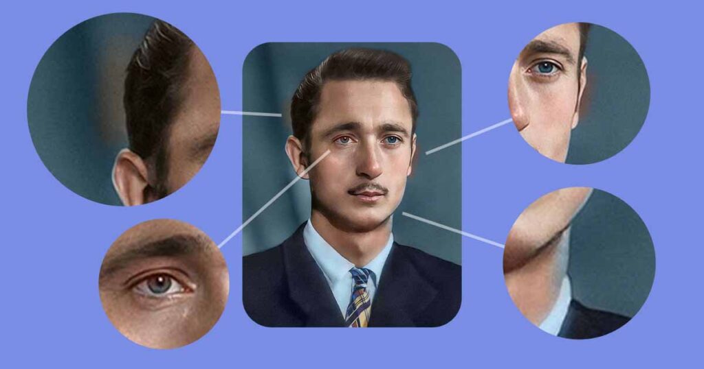
Facial details
Faces are always given a lot of emphasis and attention by humans. We are naturally drawn to love faces and all things human. As a result, portrait paintings and photographs are among the most popular types of art. But, for the same reason, people can often feel something is wrong with their faces even if they can’t put it into words.
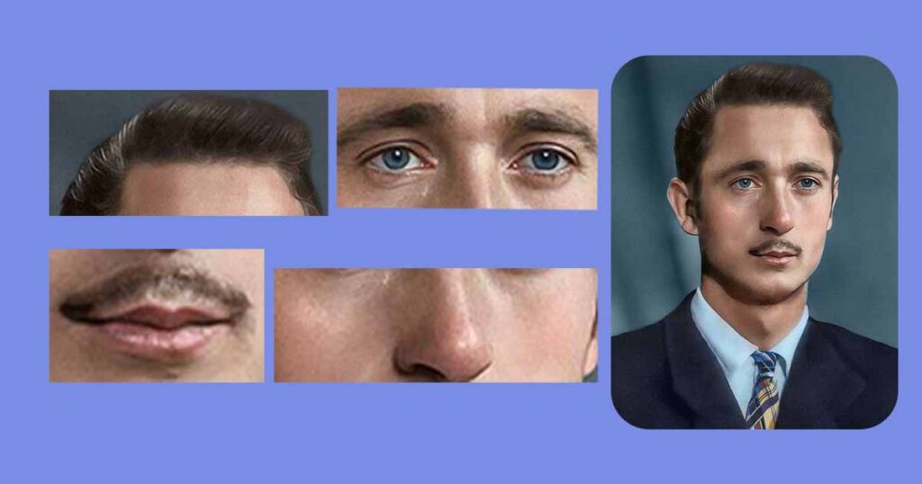
Here are some details to colorize properly in order to make the photo look as natural as possible:
- Lips: Lips should be colored with a moderately saturated reddish (20-40%) or brownish color. Take special care to follow the outline of the lips and avoid coloring the teeth with pure red!
- Pupils: Fill in the pupils with a single color. Don’t make it too saturated, as this will make your eyes look like they’re wearing fake colorful lenses.
- Eye white: Despite its name, eye white is not white. When coloring it, use a very low (5-10%) saturation of blue or yellow.
- Tear ducts: A bright, saturated red color (30-50%) should be used to color this area of both eyes.
- Conjunctiva (Inner part of eyelid): The conjunctiva is a red part of the eyelid that touches the eye directly. This part, like the tear ducts, should be colored bright red (30-50%).
- Teeth: If you want model-like white teeth, color them with low saturation blue; otherwise, if you want them to look natural, color them with low saturation yellow or red (5-10%). Also, don’t pay attention so you don’t color your lips with this color, as it will ruin their appearance.
- Blush: Apply very light blush to areas such as the cheeks, nose, eyelids, ears, neck, and forehead. Use a color that is very close to your natural skin tone, but slightly more reddish and saturated; don’t go overboard here. Choose these colors using information from the previous chapter!
- Hair: Make sure to add some color variations to the hair as well. Nobody on the planet will have hair that is only one solid color. Because of the light reflections discussed earlier, hair, like everything else, must be colored with a few tones.
This should be it, colorizing this details with special attention will make a huge difference in how your portrait colorization looks!
Other details
And lastly, here are a few more examples of other details that should be colored using previous chapter knowledge:
Clothing and fabrics: Paying attention to the textures, patterns, and colors of clothing can greatly enhance the visual appeal of a colorized photo. Properly capturing the fabric’s sheen, folds, and details adds depth and realism to the overall image.
Environmental elements: Colorizing the background and surrounding elements is essential to create a believable context. It involves identifying and accurately rendering the colors of objects like furniture, landscapes, architecture, or other elements present in the original photo.
Accessories and props: Adding color to accessories such as hats, jewelry, and other props can significantly enhance the overall visual interest and storytelling potential of the image. Attention to details like gemstones, metals, or wood can make a striking difference.
Remember, photo colorization is an art that requires both technical expertise and a keen eye for detail. Don’t worry if you can’t colorize all the details yet, it will come with time, so just have fun!
Create New layer
One final tip is to create a new layer on top of all of the Flat Color layers that we created and focus solely on it. In contrast to FC, you do not need a separate layer for each color; instead, it is preferable to keep all colors on the same layer for the sake of speed and convenience of work.
It is now time to put all of your theoretical knowledge into practice:
- Create a New Layer
- Switch the Blending Mode from Normal to Color
- Choose a color from a reference photo or choose one on your own using the tips we previously shared with you.
- Colorize smaller details on the photo with a Brush tool and the previously described settings (Flow of 1-6%).
That’s all. This process is simple to grasp but difficult to master, so take your time and allow yourself to make mistakes.
If something does not appear during the process:
Remember to use the Undo (Ctrl + Z) and Eraser tools to correct any mistakes.
Use the Eraser or Brush tool to remove or repaint areas where you have carelessly colored out some details from their contour.
Pro tip: If you want to experiment with colorizing some element of the photo but aren’t sure if it will look good or not, just create a new layer on top of it, colorize the details there, and if you like how it looks, you can just leave the layer and keep working with it, blend it with the layer below, or just remove it if the result wasn’t what you were expecting.
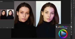
4. Enhance and Correct Colors
We’re almost there; the last few steps will be much easier and faster, so keep going! So, now that you’ve colored your photo using all of the information we’ve provided, it’s time to correct them.
We worked with hundreds of layers, made numerous changes and adjustments along the way, and corrected and edited mistakes hundreds of times. Because we are all just people, we became tired and thus oblivious to mistakes.
Take a short brake
Taking a 2-5 minutes brake will be more than enough to refresh your vision and get the ability to spot mistakes much easier!
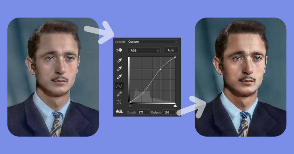
Use Curves and Camera Row Filter
We recommend using two main tools for color correction and general photo enhancement, aka postprocessing: Curves adjustment layer and Camera Raw Filter.
If you are already familiar with Photoshop and prefer to use Levels instead of Curves, you can do so; however, if you are new, we strongly advise you to use Curves because it is far more advanced and convenient than the other.
What are Curves and how to use them
Let’s start with the Curves. Firstly let us explain you some basic mechanics of Curves layer in a very simplified way.
Think of the Curves adjustment in Photoshop as a tool that helps you adjust the brightness and contrast of different tonal ranges in your image.
Imagine a graph with a diagonal line running from the bottom left corner to the top right corner. This line represents the original tonal values of your image. The bottom left represents the darkest areas (shadows), and the top right represents the brightest areas (highlights).
- By clicking and dragging on this diagonal line, you can change the tonal values. Pulling the line upwards brightens the corresponding areas of the image, while pulling it downwards darkens them.
- You can also create points on the line and adjust them individually. For example, adding a point towards the bottom left and dragging it upwards would brighten the shadows, while adding a point towards the top right and dragging it downwards would darken the highlights.
- The shape you create by manipulating the line or adding points determines the overall contrast and tonal distribution in your image. For instance, pulling the line into an S-curve shape can increase the contrast, making the shadows darker and the highlights brighter.
- In addition to the RGB channel, you can also adjust the individual color channels (red, green, and blue) separately using the dropdown menu in the Curves dialog box. This allows you to fine-tune the color balance and correct any color imbalances.
Remember, experimenting with the Curves adjustment is key. It might take a bit of practice to get comfortable with, but once you understand the basics, you’ll have a powerful tool at your disposal for adjusting the brightness, contrast, and color balance of your images.
How to use Curves
Now that we’ve defined Curves, it’s time to put them to use. Here are the easy steps:
- Set up a Curves adjustment layer.
- Find this layer you just created in the layers tab and left click on the graph icon to see Curves options.
- If you don’t see the Curves adjustment options menu: To show this window, go to the top menu’s Window tab and click Properties (if it is already active and you see a checkmark near it, just find the actual window).
- While holding Alt, select Auto. Click the Snap Neutral Midtones button, then select one of four options in the Algorithm tab you love the most.
Done! This is an automatic method of improving the color and contrast values of your image!
If you still don’t like the way your image looks after this, you can make a few quick changes to improve it:
If the image is too bright or dark: create or use existing points and drag them down below the diagonal line to darken pixels, or up above the diagonal line to brighten pixels.
If the image is too contrasted or faded: make or use existing points. Drag the point on the left bottom side of the graph down and the point on the top right corner of the graph up to improve contrast. To reduce contrast, do the opposite.
- Everything is fine, but it is too intense: the simplest solution is to simply reduce the opacity of the layer until you have a good balance between enhancements and previous results.
- The image is too green/red/blue/yellow/purple: to correct this, change your curves from RGB to one of the following modes.
- To reduce Green, switch to the Green channel and drag the point on the graph down.
- To reduce Red, switch to the Red channel and drag the point on the graph down.
- To reduce Blue, switch to the Blue channel and drag a graph point down.
- To reduce Yellow, switch to the Blue channel and drag a graph point up.
- To reduce Purple switch to the Green channel and drag a graph point up.
That should be more than enough in order to make your colors significantly better than they were before!
What is Camera Raw Filter and how to use it
The Camera Raw Filter is a powerful tool in Photoshop that allows you to make detailed adjustments to your photos, including color correction, exposure, and more. This tool has a huge number of options that will help you to make the photo you colorized much better in a minutes!
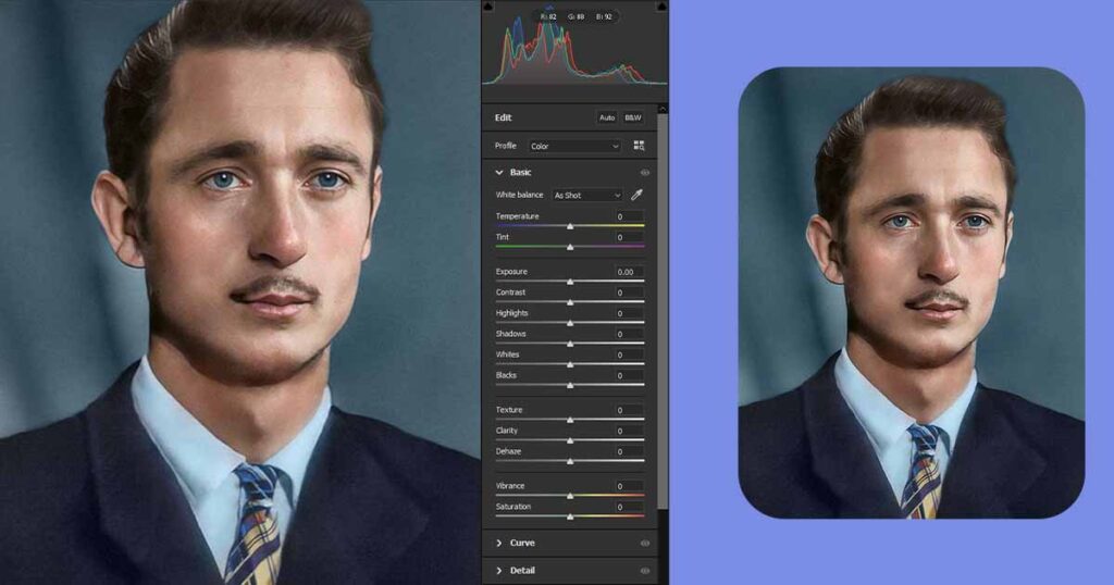
Here’s a simplified explanation of how to use the Camera Raw Filter to correct colorized photos:
- Create Merged copy of visible layers: To do this click on the top visible layer you in your layers tree and press Ctrl + Alt + Shift + E (or Cmd + Option + Shift + E on a Mac) to create a merged copy of all visible layers.
- Turn it into Smart Object: This is vital since it will allow you to go back and edit any changes later on!
- Open the Filter: Then, go to the Filter menu at the top, hover over Camera Raw Filter, and click on it. However, because this filter is so useful and popular, we recommend that you simply press Ctrl (CMD) + Shift + A to open it!
- Basic Adjustments: Start with the “Basic” tab. Here, you can adjust the exposure, contrast, highlights, shadows, whites, blacks, and clarity of your image. These sliders help you fine-tune the overall brightness, contrast, and details. Just paly with this to find what looks better with your particular image.
Detail Enhancements: The “Detail” panel allows you to sharpen your image and reduce noise. Use the sliders to enhance details and clarity while reducing any unwanted noise or graininess.
Apply Changes: Once you’re satisfied with your adjustments, click the “OK” button in the Camera Raw dialog box to apply the changes to your colorized photo. The image will be updated in Photoshop with the corrected colors and adjustments.
Remember, the Camera Raw Filter provides a non-destructive way to edit your colorized photos.
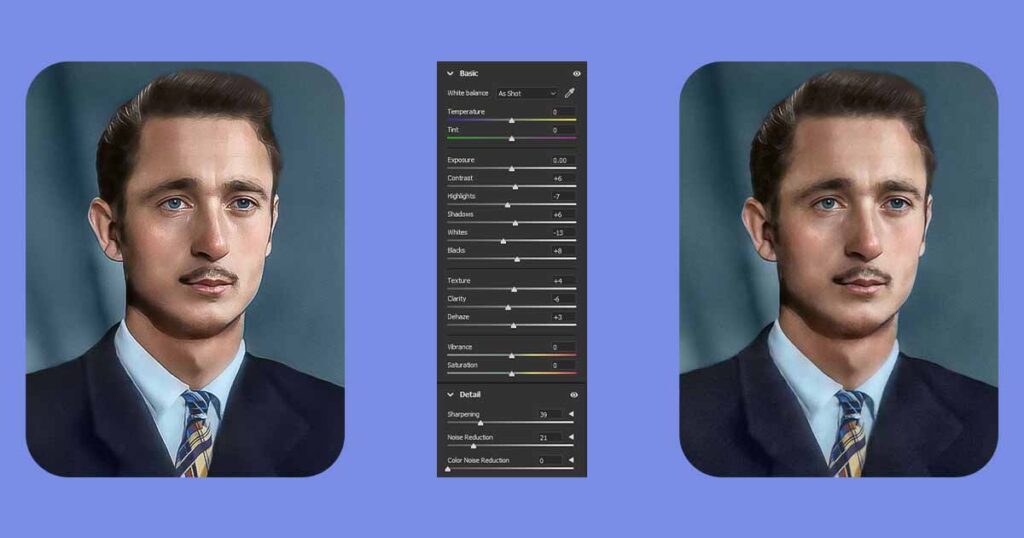
You can always go back and modify the adjustments later if needed. With practice and experimentation, you’ll be able to use this powerful tool to correct and enhance the colors in your colorized images.
5. Refine Results and Correct Mistakes
This is the final step, and we are finished! Take a well-earned 5-15-minute break. As previously stated, it will allow you to rest your eyes and brain, and you will be able to notice and correct any mistakes you may have made that you were unable to see before. Simply fix them with existing color layers or create new ones and work on top of the previous.
Use any tool you need
Because you may have different types of problems, you may need to use a different tool to solve them. Often, these are very simple and quick fixes that will significantly improve the overall quality of the image.
Here are some common mistakes you may notice and how to fix them with different tools:
- Dust, cracks, or scratches: make a new Layer and use the Spot Healing Brush and Clone Stamp.
- Stains, shadows or highlights: Create a Curves layer with either darkening or brightening set up, then inverse mask it by clicking on it and pressing Ctrl (CMD) + I, then drawing it back softly with a brush tool until it is gone.
- Wrong color, missing color, or incorrectly colored parts: simply create a new layer, set its blending mode to Color, and use a Brush tool to correct them.
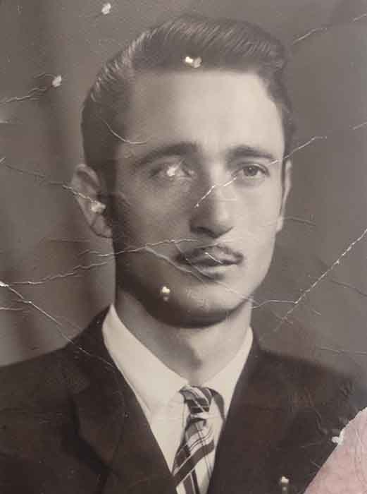
If your photo has real damage rather than just a few dust particles, you should learn how to restore old photos at home!
6. Done
Amazing, you did this! Now you can just save both PSD (Photoshop Document) file and Jpeg (image) files and you are done!
Saving PSD file will allow you to come back to this image any time in the future, and change any details you want easily.
Save files
To save it go to File – Save, enter the name of the file and click save.
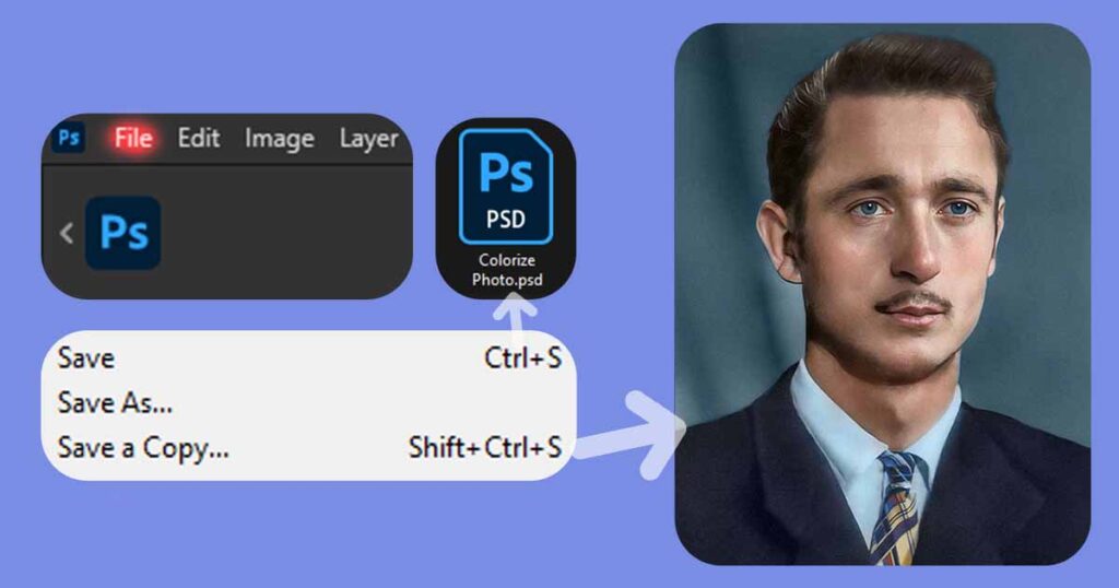
To save files as image go to File – Save As (Save a Copy in new Photoshop 2026), from the list of formats below select Jpeg, enter the name of the file and slick save!
Photo Colorization is Completed!
Congratulations on successfully completing your first photo colorization project! It was certainly not an easy task, so if you followed the tutorial and are pleased with the end result, congratulations! You did an excellent job! You might also be interested in learning how to restore old and damaged photos with Photoshop.
Don’t like the outcome?
As previously stated, photo colorization is a difficult art that cannot be learned and especially mastered in a single tutorial, but this guide provided you with a wealth of practical advice and implementations because it was written by us, experts in this field.
Consider using AI colorizers.
If you do not want to use professional photo colorization services, you can experiment with AI photo colorizers instead. Though the end results will be far less appealing than the work of true artists, you can still give it a shot!
Get it colorized by experts
If you don’t like how your final photo looks, you can try following the tutorial or specific parts of it again to fix mistakes, but if that doesn’t work and you want your photos colorized by a professional, get a free quote from us!
Let Us Colorize Your Photos
✔ Professional Photo Colorization
✔ Fast Delivery (1-4 Business days)
✔ Low Price Without Taxes or Fees
✔ Unlimited Free Revisions
✔ Satisfaction Guarantee
LEARN MORESubscribe to Newsletter


Comments are closed.